CSS Modules
Welcome to the Future
If you wanted to identify an inflection point in the recent development of CSS thinking, you’d probably pick Christopher Chedeau’s “CSS in JS” talk from NationJS in November, 2014. It was a watershed moment that set a bunch of different minds spiralling off in their own directions like particles after a high-energy collision. For instance, React Style, jsxstyle and Radium are three of the newest, cleverest, and most viable approaches to styling in React and all reference it in their project Readme. If invention is a case of exploring the adjacent possible, then Christopher is responsible for making a lot of what’s possible more adjacent.
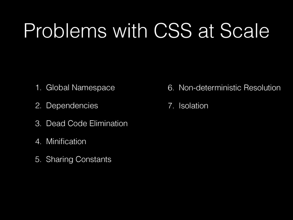
These are all legitimate problems that affect most large CSS codebases in one way or another. Christopher points out that these all have good solutions if you move your styling to JavaScript, which is true but introduces its own complexities and idiosyncrasies. Just look at the range of approaches to handling :hover states among the projects I referenced earlier, something that has been solved in CSS for a long time.
The CSS Modules team felt we could attack the problem head-on — keep everything we liked about CSS, and build upon the good work that the styles-in-JS community was producing. So, while we’re bullish about our approach and firmly defend the virtues of CSS, we owe a debt of gratitude to those folks pushing the boundaries in the other direction. Thanks, friends! 👬👫👭
Let me tell you about what CSS Modules is, and why it’s the future.

Step 1. Local by default.
In CSS Modules, each file is compiled separately so you can use simple class selectors with generic names — you don’t need to worry about polluting the global scope. Let’s say we were building a simple submit button with the following 4 states.
Before CSS Modules
We might code this up using Suit/BEM-style classnames & plain old CSS & HTML like so:
/* components/submit-button.css */
.Button { /* all styles for Normal */ }
.Button--disabled { /* overrides for Disabled */ }
.Button--error { /* overrides for Error */ }
.Button--in-progress { /* overrides for In Progress */
<button class="Button Button--in-progress">Processing...</button>It’s quite good, really. We have these four variants but BEM-style naming means we don’t have nested selectors. We’re starting Button with a capital letter so as to (hopefully) avoid clashes with any of our previous styles or any dependencies we’re pulling in. And we’re adopting the --modifier syntax to be clear that the variants require the base class to be applied.
All in all, this is reasonably explicit & maintainable code, but it requires an awful lot of cognitive effort around naming discipline. But it’s the best we can do with standard CSS.
With CSS Modules
CSS Modules means you never need to worry about your names being too generic, just use whatever makes the most sense:
/* components/submit-button.css */
.normal { /* all styles for Normal */ }
.disabled { /* all styles for Disabled */ }
.error { /* all styles for Error */ }
.inProgress { /* all styles for In Progress */
Notice that we don’t use the word “button” anywhere. Why would we? The file is already called “submit-button.css”. In any other language, you don’t have to prefix all your local variables with the name of the file you’re working on — CSS should be no different.
That’s made possible by the way CSS Modules is compiled — by using require or import to load the file from JavaScript:
/* components/submit-button.js */
import styles from './submit-button.css';

buttonElem.outerHTML = `<button class=${styles.normal}>Submit</button>`
The actual classnames are automatically generated and guaranteed to be unique. CSS Modules takes care of all that for you, and compiles the files to a format called ICSS (read my blog post about that), which is how CSS and JS can communicate. So, when you run your app, you’ll see something like:
<button class="components_submit_button__normal__abc5436">
  Processing...
</button>
If you see that in your DOM, that means it’s working!

(credit: Christopher Hastings)
Naming conventions
Considering our button example again:
/* components/submit-button.css */
.normal { /* all styles for Normal */ }
.disabled { /* all styles for Disabled */ }
.error { /* all styles for Error */ }
.inProgress { /* all styles for In Progress */
Notice that all the classes are stand-alone, rather than one being the “base” and the rest being “overrides”. In CSS Modules each class should have all the styles needed for that variant (more on how that works in a minute). It makes a big difference to how you use these styles in JavaScript:
/* Don't do this */
`class=${[styles.normal, styles['in-progress']].join(" ")}`

/* Using a single name makes a big difference */
`class=${styles['in-progress']}`

/* camelCase makes it even better */
`class=${styles.inProgress}`
Of course, if you get paid by the keystroke, do what you want!
A React Example
There’s nothing about CSS Modules that’s React-specific. But React gives you a particularly excellent experience using CSS Modules, so it’s worth showing a slightly more complex example:
/* components/submit-button.jsx */
import { Component } from 'react';
import styles from './submit-button.css';

export default class SubmitButton extends Component {
  render() {
    let className, text = "Submit"
    if (this.props.store.submissionInProgress) {
      className = styles.inProgress
      text = "Processing..."
    } else if (this.props.store.errorOccurred) {
      className = styles.error
    } else if (!this.props.form.valid) {
      className = styles.disabled
    } else {
      className = styles.normal
    }
    return <button className={className}>{text}</button>
  }
}
You can use your styles without ever worrying about what global-safe CSS classnames are being generated, which lets you focus on the component, not the styling. And once you’re rid of that constant context-switching, you’ll be amazed you ever put up with it.
But that’s just the start. When it is time to think about how your styles are put together, CSS Modules has your back.
Step 2. Composition is everything
Earlier I mentioned that each class should contain all the styles for the button in each different state, in contrast to BEM where it assumes you’d have more than one:
/* BEM Style */
innerHTML = `<button class="Button Button--in-progress">`

/* CSS Modules */
innerHTML = `<button class="${styles.inProgress}">`
But wait, how do you represent shared styles between all the states? The answer is probably CSS Modules’ most potent weapon, composition:
.common {
  /* all the common styles you want */
}
.normal {
  composes: common;
  /* anything that only applies to Normal */
}
.disabled {
  composes: common;
  /* anything that only applies to Disabled */
}
.error {
  composes: common;
  /* anything that only applies to Error */
}
.inProgress {
  composes: common;
  /* anything that only applies to In Progress */
}
The composes keyword says that .normal includes all the styles from .common, much like the @extends keyword in Sass. But while Sass rewrites your CSS selectors to make that happen, CSS Modules changes which classes are exported to JavaScript.
In Sass
Let’s take our BEM example from above and apply some of Sass’ @extends:
.Button--common { /* font-sizes, padding, border-radius */ }
.Button--normal {
  @extends .Button--common;
  /* blue color, light blue background */
}
.Button--error {
  @extends .Button--common;
  /* red color, light red background */
}
This compiles to this CSS:
.Button--common, .Button--normal, .Button--error {
  /* font-sizes, padding, border-radius */
}
.Button--normal {
  /* blue color, light blue background */
}
.Button--error {
  /* red color, light red background */
}
You can then just use one class in your markup <button class="Button--error"> and get the common & specific styles you want. It’s a really powerful concept, but the implementation has some edge cases & pitfalls that you should be aware of. A great summary of those issues and links to further reading is available here, thanks to Hugo Giraudel.
With CSS Modules
The composes keyword is conceptually similar to @extends but works differently. To demonstrate, let’s look at an example:
.common { /* font-sizes, padding, border-radius */ }
.normal { composes: common; /* blue color, light blue background */ }
.error { composes: common; /* red color, light red background */ }
That gets compiled and ends up looking like this by the time it reaches the browser:
.components_submit_button__common__abc5436 { /* font-sizes, padding, border-radius */ }
.components_submit_button__normal__def6547 { /* blue color, light blue background */ }
.components_submit_button__error__1638bcd { /* red color, light red background */ }
In your JS code, import styles from "./submit-button.css" returns:
styles: {
  common: "components_submit_button__common__abc5436",
  normal: "components_submit_button__common__abc5436 components_submit_button__normal__def6547",
  error: "components_submit_button__common__abc5436 components_submit_button__error__1638bcd"
}
So we can still just use styles.normal or styles.error in our code but we get multiple class rendered into the DOM.
<button class="components_submit_button__common__abc5436
               components_submit_button__normal__def6547">
  Submit
</button>
This is the power of composes, you can combine multiple separate groups of styles without changing your markup or rewriting your CSS selectors 👌
Step 3. Sharing between files
Working with Sass or LESS, each file that you @import gets processed in the same global workspace. It’s how you can define variables or mixins in one file and use them in all your component files. It’s useful, but as soon as your variable names threaten to clash with each other (since it’s another global namespace), you inevitably refactor out a variables.scss or settings.scss, and you lose visibility into which components depend on which variables. And your settings file becomes unwieldy.
There are better methodologies (in fact Ben Smithett’s post about using Sass & Webpack together was a direct influence on the CSS Modules project and I encourage you to read it) but you’re still constrained by the global nature of Sass.
CSS Modules runs on a single file at a time, so there’s no global context to pollute. And like in JavaScript where we can import or require our dependencies, CSS Modules lets us compose from another file:
/* colors.css */
.primary {
  color: #720;
}
.secondary {
  color: #777;
}
/* other helper classes... */
/* submit-button.css */
.common { /* font-sizes, padding, border-radius */ }
.normal {
  composes: common;
  composes: primary from "../shared/colors.css";
}
Using composition, we are able to reach into a totally general file like colors.css and reference the one class we want using its local name. And since composition changes which classes get exported, not the CSS itself, the composes statements themselves get deleted from the CSS before it reaches the browser:
/* colors.css */
.shared_colors__primary__fca929 {
  color: #720;
}
.shared_colors__secondary__acf292 {
  color: #777;
}
/* submit-button.css */
.components_submit_button__common__abc5436 { /* font-sizes, padding, border-radius */ }
.components_submit_button__normal__def6547 {}
<button class="shared_colors__primary__fca929
               components_submit_button__common__abc5436
               components_submit_button__normal__def6547">
  Submit
</button>
In fact, by the time it reaches the browser, our local name “normal” has no styles of its own. This is a good thing! It means we were able to add a new locally-meaningful object (an entity called “normal”) without adding a single new line of CSS. The more we can do this, the fewer visual inconsistencies that will creep into our site and the less bloat we’ll be shipping to our customers’ browsers.
Aside: These empty classes can easily be detected and removed by something like csso
Step 4. Single responsibility modules
Composition is powerful because it lets you describe what an element is, not what styles make it up. It’s a different way of mapping conceptual entities (elements) to styling entities (rules). Let’s take a look at a simple example in plain-old-CSS:
.some_element {
  font-size: 1.5rem;
  color: rgba(0,0,0,0);
  padding: 0.5rem;
  box-shadow: 0 0 4px -2px;
}
This element, these styles. Simple. However, there’s a problem: the colour, font-size, box-shadow, the padding — everything is specified here in full detail despite the fact that we probably want to reuse these styles elsewhere. Let’s refactor it using Sass:
$large-font-size: 1.5rem;
$dark-text: rgba(0,0,0,0);
$padding-normal: 0.5rem;
@mixin subtle-shadow {
  box-shadow: 0 0 4px -2px;
}

.some_element {
  @include subtle-shadow;
  font-size: $large-font-size;
  color: $dark-text;
  padding: $padding-normal;
}
This is an improvement, but we’ve only extracted half of most of the lines. The fact that $large-font-size is for typography and $padding-normal is for layout is merely expressed by the name, not enforced anywhere. When the value of a declaration like box-shadow doesn’t lend itself to being a variable, we have to use a @mixin or @extends.
With CSS Modules
By using composition, we can declare our component in terms of reusable parts:
.element {
  composes: large from "./typography.css";
  composes: dark-text from "./colors.css";
  composes: padding-all-medium from "./layout.css";
  composes: subtle-shadow from "./effect.css";
}
The format naturally lends itself to having lots of single-purpose files, using the file system to delineate styles of different purposes rather than namespacing. And if you want to compose multiple classes from a single file, there’s a short hand for that:
/* this short hand: */
.element {
  composes: padding-large margin-small from "./layout.css";
}

/* is equivalent to: */
.element {
  composes: padding-large from "./layout.css";
  composes: margin-small from "./layout.css";
}
This opens up the possibility of using extremely granular classes to give aliases for every visual trait your site uses:
.article {
  composes: flex vertical centered from "./layout.css";
}

.masthead {
  composes: serif bold 48pt centered from "./typography.css";
  composes: paragraph-margin-below from "./layout.css";
}

.body {
  composes: max720 paragraph-margin-below from "layout.css";
  composes: sans light paragraph-line-height from "./typography.css";
}
This is a technique I’m really interested in exploring further. In my mind, it combines some of the best aspects of atomic CSS techniques like Tachyons, the readability of something like Semantic UI with true, dependable isolation.
But we’re only at the beginning of the CSS Modules story. We’d love for you to try it on your current next project and help us shape its future.
Get started!
With CSS Modules, we hope that we’re able to help you and your team maintain as much of your current knowledge of CSS and your product, but become vastly more comfortable and more productive. We’ve kept the syntax additions to a minimum and tried to ensure there are examples that are close to the way you’re already working. We have demo projects for Webpack, JSPM and Browserify if you’re using one of those, and we’re always on the look-out for new environments where CSS Modules would work: support for server-side NodeJS is happening and Rails is on the horizon.
But to make things even easier, I’ve made a little Plunkr for you to play around with an example without installing a thing! Give it a go:

When you’re ready, take a look at the main CSS Modules repo and if you have a question, please raise an issue to kick off a discussion. The CSS Modules team is small and we haven’t seen every use-case yet, so we’d love to hear from you.